
References:
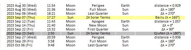
Jeffrey A. Hirsch (Aug 23, 2023) @ X
Jeffrey A. Hirsch (Aug 23, 2023) @ X
%20@%20X.jpg)
 |
| S&P 500 / ES Major High = ± Sep 08-11, 2023 (Fri-Mon) |

.jpg)


 |
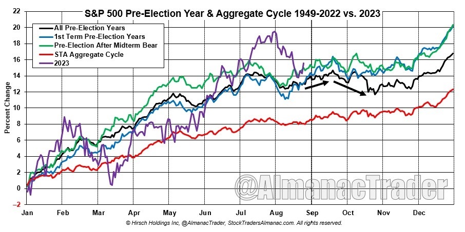
| In 2023 the 15th trading day of June will be Wednesday, 21st - summer solstice. |


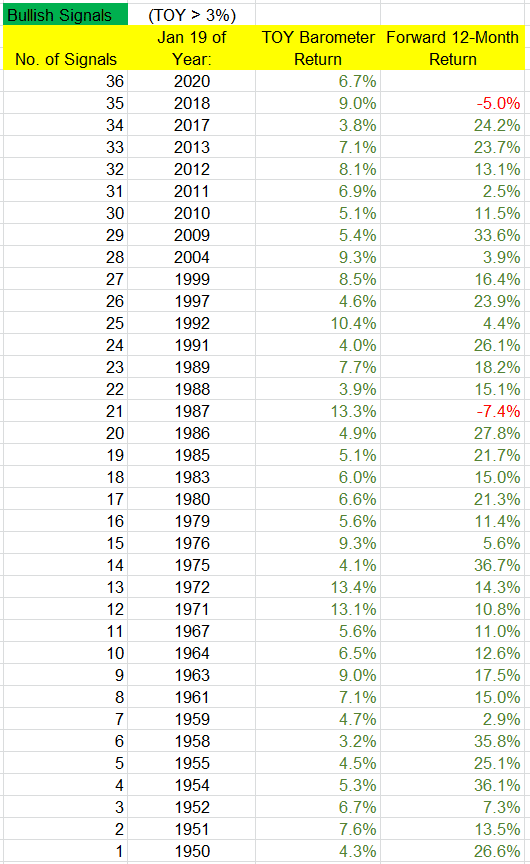
Neutral Signals: There have been 19 neutral signals. The following year was positive 12 times (63%), compared to 73% win rate for “all years.” The overall average and median returns were 6.0% and 7.1%. But among the “up” years, the average and median gains were 14.4% and 9.4%, while the “down” years’ average and median losses were -8.5% and -7.8%. There were several big up years (1995, 1996, 1998, 2003), and two big down years (1973, 1977), so even if there is a neutral signal, there’s still a decent chance the following 12 months will venture far from its January 19 print.

Bearish Signals: There have been 16 bearish signals. Only 6 (38%) of the following years posted a gain while 10 posted losses – and 6 of those 10 posted double digit losses. The overall average and median returns were -3.6% and -6.0%. The “up” years posted average and median gains of 14.6% and 15.5%, while the “down” years posted average and median losses of -14.6% and -12.9%. So despite the low win rate, when the market does well, it has the ability to do very well, as was the case this past year.

[...] When a bullish signal is in play, odds heavily favor solid gains over the following 12 months, but when there’s a bearish signal, odds favor a down year with a relatively big loss. But regardless of the signal, “up” years tend to be very good.


Toby Crabel (1990) - Computer studies suggest that Inside Days (ID) provide very reliable entries in the S+P market. The data used in the studies is daily open, high, low and close prices from 1982 to 1987. All of the following patterns are defined for a computer but can be seen easily on a daily bar chart.

The market action implied in each pattern is a short-term trend with a loss of momentum on the Inside Day. The open on Day 1 is in the opposite direction of the trend and is an indication of a shift in sentiment. This shift in sentiment causes those who still have existing positions against the opening direction to liquidate longs or cover shorts. Participants covering their positions is more than enough to tip off a directional move.
A slightly different perspective on the same type of pattern is to look for a retracement to the previous day's close after the opening and take a position at that point in the direction of the open. I tested four patterns to demonstrate this principle.
How can you use this information? It suggests a strong bias in the direction of the open especially after a higher open. The prolonged bull market obviously had an impact on these results but in general, a counter move back to Day 2's close after the opening direction is known, should be observed for a loss of momentum and possible entry in the direction of the open.
Another totally different test in the S+P has same interesting implications and could be tied in with the previous patterns. On any day that the market has moved two hundred points above the open intra-day, it has closed above the open ninety percent, of the time. Also, on any day that the market has moved two hundred points below the open it has closed below the open eighty-eight percent of the time. This was during the period from 1982-1988.
An application of these results is as follows: Enter in the direction of the initial trend on any low momentum move back to the open and exit on the close of the session. This can be done after the initial trend is established with a two hundred point move in one direction off the open. The main qualification is price action on the pullback. A high momentum move back through the open leaves the initial two hundred point move in question. This can also be applied after an Inside Day very effectively.
I think it is necessary to shed light on how extraordinary the results for Inside Days are: A test on a sale of a higher open or buy of a lower open with no other information to work with provides a winning trade fifty-six percent of the time when exiting on the close the same day of entry. This suggests a natural tendency for the market to reverse the opening direction by the time of the close.
This natural tendency is reversed after an ID. Why? What is it about an ID that produces follow through after the open? An ID is narrower than the previous day. Any narrowing day shows loss of momentum and when within a previous day's range it forms a congestion area. A congestion is directionless trade with the market searching for new information. A temporary state of balance or equilibrium exists.
There is a tendency for the market to trend after a congestion. If an Inside Day is a valid congestion, it will produce an imminent trend day. One can assume from the above tests that there is a tendency to trend after these patterns (ID). These tests support the premise that Inside Days are valid congestion areas. It appears that market participants act on the first piece of information indicating trend after the Inside Day - the open. Also, the direction of the close on the ID will provide further clues on the direction of the breakout when added to the information of opening direction. The increase in percentage profit and relative profits when these variables are added supports this conclusion.
 |
| The ID pattern acts as a continuation 62% of the time. A breakout occurs when price closes either above the top of the pattern or below the bottom of it. Since inside days act as a continuation pattern, expect the breakout to be in the same direction as the inbound price trend. Wait for price to either close above the top or below the bottom of the pattern before taking a position. The ID can form midway in a price trend, just like bull flags, wedges and pennants. |
Why do these indications work so well in the S+P? The S+P generally is an urgent market. The distinguishing characteristic of this market is its tendency to trend throughout the session. This market is notorious for big, fast moves intra-day. Peter Steidlmayer (Markets and Market Logic) calls it a One-Time Frame market. One may reason that in a One-Time Frame market the inside day is a more reliable indication of upcoming trend than in a Two-Time Frame market. The market principle that is in force is contraction/expansion. The Inside Day is contraction, and in a One-Time Frame market 1-Day contraction is all that is necessary to tip off a directional move.
In summary, the above tests suggest that an Inside Day is a valid congestion area and it follows that all breakout rules for congestion areas should be implemented after an Inside Day forms. The resulting breakout is expansion.
 |
| Three-Bar Inside Bar Pattern by Johnan Prathap - HERE & HERE |
[...] The Principle of Contraction / Expansion is defined as the market phenomenon of change from a period of rest to a period of movement back to a period of rest. This interaction between the phases of motion and rest are constantly taking place, with one phase directly responsible for the others' existence. A Trend Day is defined as a day when the first hour's trade comprises less than 10% of the day's range or the market has no dominant area of trade throughout the session. Trend days are characterized by an opening near one extreme and a close on the opposite extreme of the daily range. Trend days fall into the category of expansions. Congestion is a series of trading days with no visible progress in either direction. Usually associated with narrow range days or non-trend days. Contraction is a market behavior represented by a congestion or dormant period either short-term (ID) or long-term narrow range (8 Bar NR) and usually reaching its narrowest phase at the end of the period.
Larry Williams presented a free session at the November 2014 Las Vegas Traders Expo in which he discussed 8 possible Range Patterns. He showed that from any bar to the next there are only 4 possible outcomes:
Price action cannot occur in any other way. Within these 4 Range Patterns each last bar can either be an up bar or a down bar. So there are actually 8 possible Range Patterns:

1. Down Range, Down Day
2. Down Range, Up Day
3. Up Range, Down Day
4. Up Range, Up Day
5. Inside Range, Down Day
6. Inside Range, Up Day
7. Outside Range, Down Day
8. Outside Range, Up Day
Using these 8 patterns some powerful strategies can be created. Larry Williams presented back-tested statistics associated with trading these patterns using a simple entry and exit technique. He stressed that they were not the best entry or exit techniques but shown because they were easy to understand and program. This strategy is intended only to show where we have a bias or advantage in the marketplace.
His message was that we could go home and verify using our own software. His results for testing this on the e-mini S&Ps from 2002 forward [to 2015] were as follows:

So, the Down Range, Down Close day [1.] offers the best potential short term 'long' setup based on net profit. This was the take-home message of the presentation.
Larry further dug into the Down Range, Down Close setup to uncover which day of the week offered the best trade: The stats support the 'Turnaround Tuesday' concept.

And further investigating by Trading Day of Month revealed that 1, 17, 19, 22 and 23 were the best days, showing 92% winners and $47,500 net profits with 107 trades.
It was also found that a Down Range Larger Range day was better than a Down Range smaller Range day. $205 Avg 80% Win, vs $33 Avg 85% win,
Also naked close was better than a covered close (naked close meaning that the close was outside of the previous day’s range). $155 Avg 83% Win vs $30 Avg 83% Win
And combining these two concepts:
Down Range, larger range, Covered close: $60 Avg, 83% Winners
Down Range, larger range, Naked close: $215 Avg, 85% Winners
References: