Showing posts with label Continuation Pattern. Show all posts

Saturday, July 19, 2025

"Bull Hook" Toby Crabel Price Pattern in the S&P 500

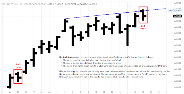
The Toby Crabel Bull Hook pattern, present on July 18 (Fri), in the S&P 500 Cash Index, implies a potential short-term upward move for trading starting July 21, 2025. 
 
A Bull Hook happens when a bar has a lower range than the previous one, with its opening price
higher than the previous bar’s high and its closing price lower than the previous bar’s close.
 
Price action created the narrowest range of the last 8 days with a lower daily close. The daily bar has a "hook" shape (a bull flag on lower timeframes), hinting at a potential reversal to the upside due to consolidation and a shift in sentiment. The Bull Hook pattern is generally bullish, opening above the previous day's high and closing lower with a narrowing range. It's often followed by upward price moves in the days after. 
 
A recent analysis by Ali Casey provides additional insights. The Bull Hook pattern has limitations, including its better performance in trending or volatile markets, the potential for false signals and losses in some cases, and its reliance on precise execution, which can be influenced by news or macroeconomic events.
 

Saturday, February 1, 2025

M & W Wave Patterns │ Arthur A. Merrill

In 1971, Robert A. Levy made the first attempt to systematically classify price patterns. He categorized five-point patterns, defined by price swings influenced by stock volatility, and tested their significance. Although he was unable to identify any substantial forecasting power, he introduced a valuable concept: the five-point categorization of time-price patterns.

» Pick any five consecutive turning points. If the first of the four swings is upward, 
the pattern forms an M. If the first swing is downward, the pattern is a W. «
Arthur A. Merrill, 1984.
 
This method remained dormant for a decade until Arthur A. Merrill revived it and published applicable results in the early 1980s: He employed the same five-point pattern approach, but instead of Levy's volatility filter, he used a rather large 8-percent swing filter in his research study. (Of course, since time and price are fractal, Merrill's patterns are too; they appear on every price swing scale across all timeframes.)
 
Merrill's 16 M and 16 W wave patterns, and their statistical occurrences: Are some of these patterns bullish? 
Are some bearish? When a certain pattern occurred in the past, what happened to prices after the pattern?

Merrill organized five-point patterns based on the sequential order of points from high to low, creating a structured taxonomy of "Ms" and "Ws". He identified 32 distinct patterns, grouping them into two categories: 16 resembling a capital M and 16 resembling a capital W. He then highlighted six subcategories, based on classical chart pattern names used by market technicians:

Uptrends                                            M15, M16, W14, W16
Downtrends                                      M1, M3, W1, W2
Triangle                                               M13, W4
Head and Shoulders                      W6, W7, W9, W11, W13, W15
Inverted Head and Shoulders    M2, M4, M6, M8, M10, M11
Broadening                                        M5, W12
 

For example, an M1 is a strongly descending pattern, while the middle patterns, M8 and M9, are flat. An M16 is a strongly ascending pattern. Similarly, a W1 is a descending pattern, the middle Ws are flat, and a W16 is an ascending pattern.
 
So, what is the practical application and benefit of Merrill's weird-looking M & W Wave Patterns in trading? They can be used to identify support/resistance levels, determine areas of interest, anticipate market direction and reversals, project extensions, define entry and exit points, and manage risk. 
 

How? You may want to watch the following video, as well as review the references and recommendations provided below.
 
 
Reference:
 
See also: 

Tuesday, November 26, 2024

Support Holds on S&P 500, Bullish Pattern Targets 6,100s | Stephen Suttmeier


First support shifts slightly to the 5870s-5850s area on the S&P 500, which bent but did not decisively break last week. Continuing to hold this support would keep the pattern bullish, with upside potential to the July-September cup and handle. The early 2022 to early 2024 big base breakout targets are into the 6,100s. The cup and handle breakout and retest zone at 5,700-5,650 offers additional support.


The S&P 500 advance-decline (A-D) line reached a new high on Friday (11/22), and the NYSE Composite stocks A-D line hit a new high yesterday (11/25). This neutralizes the mid-October to early November bearish divergences for these market breadth indicators. It also provides bullish confirmation for the new highs on the NYSE and serves as a potential leading indicator for new highs on the S&P 500, increasing the likelihood of following bullish seasonality into year-end.

Stephen Suttmeier, November 26, 2024 [HERE], and [HERE]
 

Trend-wise, while the cap-weighed S&P 500 continues to float above its trendline, the chart above shows that the index is only two standard deviations above trend. At major extremes it can reach three standard deviations.

Tuesday, October 15, 2024

S&P 500 Cup-and-Handle Breakout Targets 5,930 & 6,180 | Stephen Suttmeier

The S&P 500 has experienced a bullish breakout from a cup-and-handle formation that formed between July and September, indicating potential upside targets of 5,930 and 6,180. 


Seasonal trends for the fourth quarter further support these targets. Last week’s tactical breakout appears strong, with support near the 5,775-5,745 range. Importantly, the cup-and-handle pattern remains intact as long as the S&P 500 stays above the 5,600s.


Sunday, September 8, 2024

Toby Crabel’s "Bull Hook" Trading Strategy Tested | Ali Casey

As an algo trader, I value patterns for their ease of programming and testing, which allows for the development of robust trading strategies. Today, we'll explore bull and bear hooks, patterns that can vary in details but generally serve to catch traders on the wrong side. Toby Crabel, Joe Ross, and Thomas Bulkowski, among others, have variations of these patterns.

Toby Crabel's original definition of the Bull Hook pattern:
» A Bull Hook occurs on Day 2. A Bull Hook is defined as a day with a higher open than the 
previous day's high followed by a lower close with a narrowing daily range. The next day (Day 1), 
a trade is taken on the initial move off the open, preferably to the upside. «
 
Toby Crabel's original definition of the Bear Hook pattern:
  » Bear Hook is a day in which the open is below the previous day's low and the close 
is above the previous day's close with a narrow range relative to the previous day. As implied by 
the name there is a tendency for the price action following a Bear Hook to move to the downside. «

The Bull Hook pattern has two main forms:

Bull Hook 1: In a downtrend, the pattern is identified when today's bar is an up bar with a smaller range than the previous day and is an inside day (high lower, low higher than the previous bar). We buy with a stop order above the high of this bar.
Bull Hook 2: Here, today's bar is a down bar with a smaller range than the previous day, opening above the previous high and closing below the previous close. This pattern involves just two bars.


For testing, I used TradeStation with S&P 500 e-mini futures data. The backtest for Bull Hook 1 was disappointing, showing a loss with only 15 trades, which seemed unusual given its pullback nature. A deeper analysis suggested that the specific conditions, particularly the inside day and green bar requirements, were limiting trades. By removing some conditions, like the inside day and green bar, and focusing on a simpler pullback strategy, the results improved significantly with about 200 trades and positive performance metrics. 
 
For Bull Hook 2, the test also yielded fewer trades than expected, which might be attributed to its breakout nature, not performing well on the S&P 500. Simplifying the conditions here also improved the results somewhat, though it remained less effective. The Bear Hook pattern, when flipped for long trades, performed better but still had a low trade count. Removing some conditions and simplifying it increased the trade count and improved performance. 
 
While both Bull Hook patterns had potential, their effectiveness was highly dependent on specific conditions and the number of trades generated. Simplifying the patterns often led to better results.

Friday, August 30, 2024

Re-Accumulation and Re-Distribution Range Patterns | Richard D. Wyckoff

The Re-Accumulation process is exactly identical to the Accumulation process. The only difference between the two is the way the structure begins to develop. While the Accumulation range begins by stopping a bearish movement, the Re-Accumulation range begins after the stop of an upward movement. Re-accumulation and re-distribution generally unfold in four distinct continuation range patterns.
 
S&P 500 E-mini Futures (4 hour bars - August 15-30, 2024) — Distribution or Re-Accumulation?
 
 
 The Eternal Recurrence of the Same.
 
(1.) Accumulation, (2.) Mark Up, (3.) Distribution, (4.) Mark Down.

To put it another way: A Re-Accumulation occurs during a longer-term up trend, which will continue in the future. The main street is finally on the right side as well. Inside a Wyckoff Re-Accumulation schematic, buyers are closing parts of their long positions and sellers are joining the market. With the incoming selling positions, market makers can fill new long positions again.

 4 Types of Re-Accumulation Ranges a.k.a. Continuation Patterns a.k.a. Trend Continuation:
(1.) Re-Accumulation after a Decline.
(2.) Re-Accumulation with Spring Action.
(3.) Re-Accumulation after a Shakeout.
(4.) Re-Accumulation with an Uprising Structure.

The 4 Re-Distribution types are simply the opposite (lower 4 schematics):
(1.) Re-Distribution after a Rally.
(2.) Re-Distribution with Spring Action.
(3.) Re-Distribution after a Shakeout.
(4.) Re-Distribution with a Declining Structure.

 Examples of different types of Re-Accumulation Patterns in the Apple (AAPL) Weekly Chart.
 
The events and phases are still the same (see the Accumulation and Distributions Schematics - the last 4 charts). Only the beginning of the Re-Accumulation cycle is different and equals the start of a distribution cycle. Take a look at the Wyckoff distribution schematics below for the occurring events. The main events that differ from an accumulation or distribution cycle are the occurrences of the Creek. The Creek is a small trend over time and can equal a smaller consolidation. The Creek builds liquidity on both sides of the market and misleads market participants. The Jump Across the Creek (JAC) is the event that causes the SoS. The Jump Across the Creek does take out previous resistance lines with a strong up move. The Jump Across the Creek can also occur inside the trading range of the accumulation. The Creek can be the horizontal resistance defined by Phases A and B or an internal trend line that formed inside Phase B.
  • After the spring and test events, there is a bullish price move with momentum. This is called the Jump Across the Creek. Price continues with a bullish Phase E.
  • Usually, any shakeout and/or decline action before Re-Accumulation will have a local smaller distribution pattern (cause and effect).
  • The Initial Shakeout/Decline is less pronounced during Re-Accumulation than before Accumulation.
  • Volume: Re-Accumulation usually has less supply than Accumulation.
  • The maximum swing of trading range (highest to lowest point): Re-Accumulation trading range is usually tighter compared with an Accumulation trading range.
 (1.) Re-Accumulation after a Decline
 
  • Weakest among the Re-Accumulation types.
  • Decline usually starts from a small local distribution pattern.
  • It can have different variations of the trading range (see the structure of the next 3 formations).
(2.) Re-Accumulation with Spring Action
 
  • Flat or sloping down formation.
  • It can potentially have a few lower lows with a spring being the lowest point of the trading range.
  • Leading stocks can exhibit short-term weakness after strength in this formation.
(3.) Re-Accumulation after a Shakeout
 
  • Absorption of supply happens in the trading range without violation of support.
  • Usually and depending on a position of the market, this pattern exhibits strength.
(4.) Re-Accumulation with an Uprising Structure 
 
  • Re-Accumulation with an Uprise is the strongest Re-Accumulation type.
  • This structure will exhibit higher highs / higher lows.
  • Sometimes can be confused with a topping trading range (Distribution).
 
 
 Accumulation Schematic #1: Phases A and B.

 Accumulation Schematic #1: Phases C, D and E.
 
 Distribution Schematic #3: Phases A, B, C, D and E = the Inversion of the  Accumulation Schematic #1
 
The Re-Distribution occurs inside a markdown cycle and stops a down-trend for a longer period. After bigger price moves even Main Street joins the trend. Now it is time for the market makers to bring the price into a consolidation phase to scare sellers and bring in new buyers. That ensures new liquidity for the institution’s to place new short orders. The start of a Wyckoff Re-Distribution schematic is the same as an Accumulation cycle. A Creek inside the trading range creates liquidity on both sides of the market, which gets taken by a UTAD. Many people will see this as a break-out to join bullish price action, but don’t get fooled. With a Jump across the Creek, the price is not only returning into the trading range but going to continue the downtrend from before.
 
 
  Distribution Schematic #2: Phases A and B.
 
 Distribution Schematic #2: Phases C, D and E.
 
Many believe that simply labeling the events is sufficient for detecting Wyckoff cycles. Don't forget that a supposed Distribution can become a Re-Accumulation or an Accumulation a Re-Distribution. Therefore, it is essential to presuppose a fundamental market analysis and confirm a Wyckoff cycle with COT data, Seasonality, or other longer-term confirmations. Don't make the mistake of looking for Accumulations and Distributions in lower time frames. It is easy to draw a supposed accumulation on a 5-minute chart, but a real Accumulation takes place in higher time frames. Since a Wyckoff cycle takes time to unfold, wait for the events to occur and be fully validated. Otherwise, one quickly get s distracted by the noise within the actual moves and makes bad trading decisions in the worst case. 


Wednesday, June 12, 2024

Swing Points as Trend Change Indication | Larry Williams

A trend change from up to down occurs when a short-term high is exceeded on the upside, a short-term trend change from down to up is identified by price going below the most recent short-term low. The first chart depicts such trend changes in a classic manner, study it well because reality comes next! Here are a couple of pointers on this technique. Although the penetration of one of these short-term highs, in a declining market, indicates a trend reversal to the upside, some penetrations are better than others.

» There are only two ways a short-term high or low is broken. «

There are only two ways a short-term high or low is broken. In an up trending market, the low that is violated or fallen below will be either a low prior to making a new rally high, as shown at (A) in the second figure, or a low that occurs after decline of a high that then rallies making a lower short-term high; it then declines below the low prior to the rally that failed to make a new high, as shown at (B). The better indication of a real trend change is the violation of the low shown at (A). 
 
Best Trading Patterns.
 
By the same token, a trend reversal to the upside will occur in one of the two following patterns: In (A), the rally peak prior to a new low is violated to the upside, or in (B), the market makes a higher low, then rallies above the short-term high between those two lows. In this case, again, the (A) pattern is the better indication of a real trend reversal.

 
See also:
 

Wednesday, April 3, 2024

ICT NY Midnight Open and the Previous Day's High and Low | Darya Filipenka

This is how I incorporate the New York Midnight Open (NMO) level when I prepare my premarket plan. This also helps me to predict possible trend day. Previous highs and lows are important in trading as they can indicate potential market reversals or continuation of a trend. When the market has a predisposed bias or trend, you want to focus on the previous day's high or low. If the market reaches the previous day's high and you're bullish, you want to see if it creates an optimal trade entry. Many times, this formation forms throughout the week in various currencies and assets. There are instances where the market raids the previous day's highs for buy stops and previous day's lows for sell stops. Not every previous day's high or low is the same in terms of opportunity, but there's a criteria to look for when seeking liquidity resting above or below these levels. Understanding the conditions that lead to a raid on buy stops above the previous day's high or sell stops below the previous day's low can help you identify potential market reversals.
 
PDH = Previous Day's High
PDL = Previous Day's Low 
PDA = Premium and Discount Arrays as a guide to determine where to buy and sell
 
Quoted from: